Our logo is much more than merely a corporate symbol. It speaks of what we do and why. I’ve long believed in dreams. Realizing them is quite another matter. It often takes years of effort, planning and hard work to make dreams come true. Our own ay of making a living is one such dream that required such an effort. It was and continues to be an adventure beyond words!
Back, many, many years ago I toiled in a regular job while dreaming of the day I could make my livelihood doing something I loved. Although I would have denied it at the time I really had so very far to go. I believe I was born with some raw talent, but that alone is not nearly enough to become a professional artist. I had to spend countless hours acquiring and practicing my skills just to get to the point of being able to make a living. I had to develop a style that was all my own. Building a reputation that would bring me enough work to survive would also take years. With the support and encouragement of family and friends, eventually we made it so.
Over the years as opportunity and my changing interests led me, my career changed, and with each shift a new set of skills was gained. In 1992 we formed our current company Sawatzky’s Imagination Corporation. Janis, my life and business partner of more than 35 years jokingly says I am the imagination part, while she represents the corporation. That certainly is true and absolute necessary it’s a marriage of business and art.
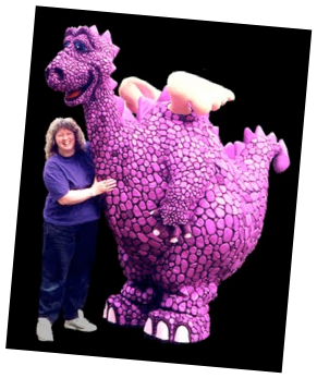
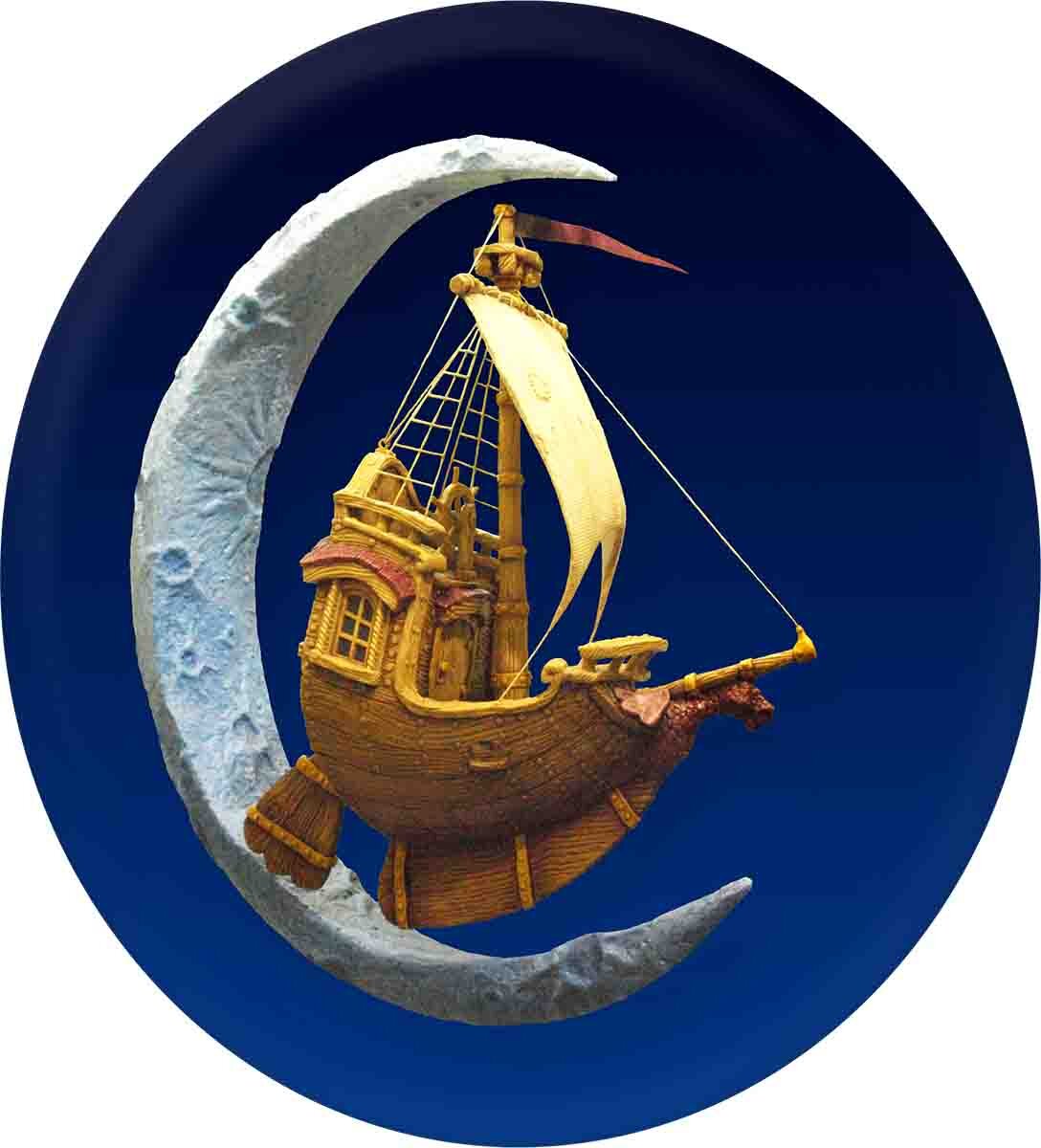
Our first logo featured a little cartoon dragon nicknamed ‘SPAZ’. Over the years he morphed from a smooth, brown skinned creature into a giant but lovable purple dragon who was truly larger than life. after serving us well for many years we thought it was time to develop a new image that focused a little less on our theme park work and represented our current broader vision. Choosing a new icon proved to be very challenging and took quite some time.
Our business is almost impossible to describe, never mind sum up in one small image. While building a display model of a little ship for my studio I fell in love with the idea of it as the new logo for our company. Spaz the dragon, our long time mascot, became the figurehead on the bowsprit. But the ship needed one more element to add some fantasy... something to symbolize the magic of realizing dreams. The saying ‘once in a blue moon’ proved to be the catalyst for the additional element and the ship looked perfect sailing though the sliver of a new moon on a dark field of stars. From this sculpture our new logo was born.
The new logo has been warmly received and our new signs featuring the sculpture was recently honored in a world -wide competition and a national competition with first place awards. I suspect we will sail with this new logo for many years to come.
-grampa dan