Sun is setting on this project.

Today we recieved work the truck would arrive tomorrow morning to pick up the Sunshine Homes sign. It was time to move it out of the shop at last. Once out in the parking lot it was time for one last picture without the cutter of the shop behind. It looks pretty cool all lit up and ready to go.

Then it was time to back into the shop and clean house. The next projects await...

-grampa dan

The sun shines!

Today our LED lighting arrived from Heico Lighting. The LED lights they manufacture are unlike anything I've ever seen before. They use a contactless technology, meaning there are no wires to hook up or solder. It is a simple matter of slipping a wire through the lighting modules. It does this through electromagnetic induction.. The only connection necessary is at the transformer.

To see an video I made (in 2010) of how easy the HEICO LED lights hook up go here.  And here's the piece as it looked finished.

sub installed.jpg

Today it was time to light up the Sunshine Homes sign. The modules were a little bigger with six LED's but everything else works the same. In a matter of minutes I fastened the plastic brackets to the sign and then snapped in the modules. After that is was a simple matter of threading a single 14 guage wire through the HEICO LED's and then hooking up both ends to the transformer.

The sign instantly came to life.

sunshine homes lights on.png

For those interested I'll also provide a link to HEICO LIGHTING

-grampa dan

Simple solutions work best

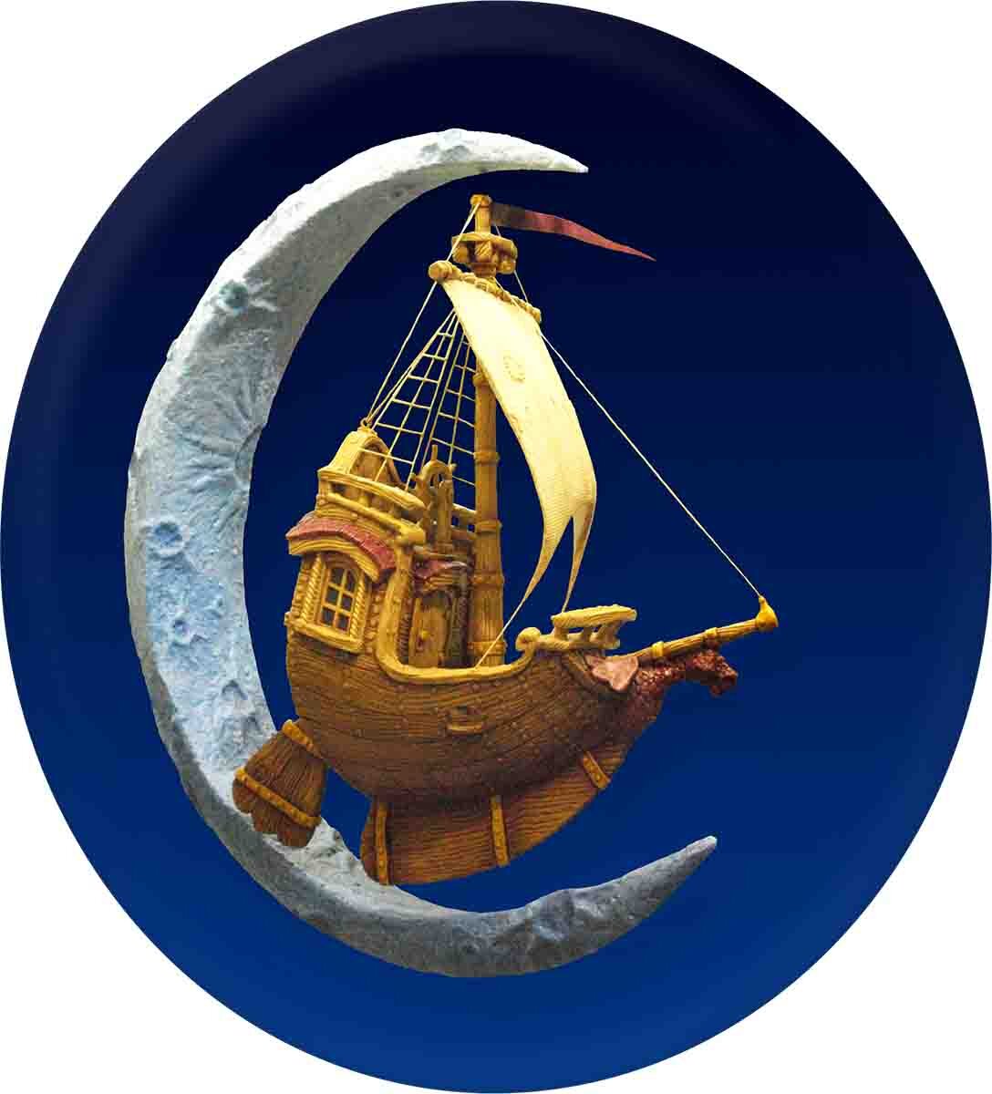
I've been struggling with the design of a website header for a long, long time. Our logo is the flying ship and crescent moon on a dark blue background. Some representation of that simply has to be there on our website. In the last years we've had a dark blue site with a light colored text. That was certainly is different and does stand out but I wanted something that was a little easier on the eyes. In the site I built last year we opted for a tan background with a dark blue header. It too worked but it wasn't something I was ever really happy with. 

We want our new website to totally focus on our work, be easy to navigate and be easy on the eyes. The tripping point has always been that dark blue band with the bright colored ship. Last night as I thought things through I visited a friend's website, Shane Durnford. Shane will be helping us with our new website has long inspired me with his simple and elegant designs on signs, graphics and websites. Simple is often very hard to do. As I studied Shane's site an idea came to mind. 

I wanted the image we use to fit in with my unique style. I am known for my hand drawn and sculpted look which incorporates what we affectionately call my wiggly line technique and lots of texture. Inspired by Shane's work I would redraw our logo in a single color using my pen and ink style I know so well.

drawn logo.jpg

As I worked, I of course lost track of time and simply enjoyed the process. I drew freehand, but on my digital drawing pad. The image came to life on my computer screen one stroke at a time. It was very, very late when I was done. I blasted a copy off to Shane and then dragged myself to bed.

This morning (which came far too fast) I took another look. I still loved it. Shane's reply was typically brief and simple...  'Love it. Speaks volumes.' 

It was instant success after years of trying.

-grampa dan