

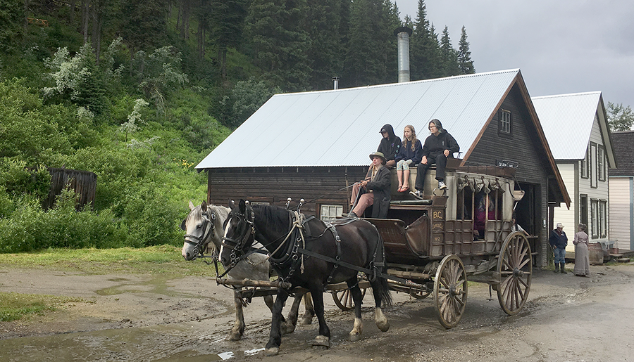
We’ve been promising Phoebe a trip to historical Barkerville for a number of years but the wildfires in the last couple of hot summers have put off those plans. This summer’s cooler start meant it was the perfect time to take the long drive and visit this historical place where gold fever brought so many folks back in the late 1800’s. The little town has been largely restored. We throughly enjoyed reliving those long ago days through many displays and experiences. Look close and you can see Phoebe up on top of the stage coach. Janis rides comfortably inside.
Filler up with premium!
It is kinda fun to do modern designs using period ideas. In this case I worked from childhood memories (I got my learner driver’s licence in 1969) as well as photographic research and also add in our own twist to make everything friendly and fun. It all has to be functional for the purpose intended. A circa 1960’s gas station wasn’t fancy nor grand but was largely functional. The design will work based on a myriad of small details such as the gas pumps, air dispenser, and signage. This drawing lays out the big picture and we’ll add the details later - in our slightly cartoonized style of course. This is going to be fun!

Freshly painted to look old!
With each project we tackle we love to experiment with new techniques. For Vala’s farm the signs we are creating need to look like old barn wood to fit in with the existing attractions. They have to look like they’ve been down on the farm and out inn the weather for decades. This meant a whole new palette of colours, bright, yet muted and aged far more than our norm. The first sign will be the test and once complete will set the direction for the rest which follow. So far the cookie Coop sign looks to be passing with flying colours! Becke and Alyssa are doing well!
